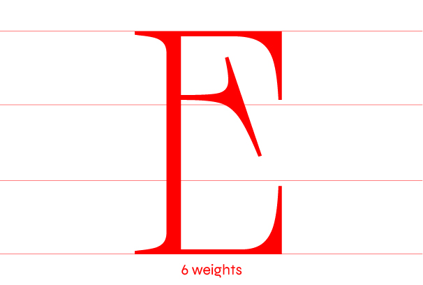
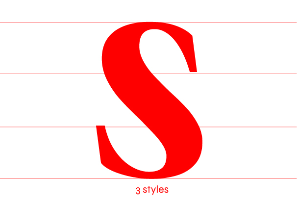
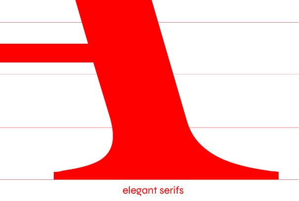
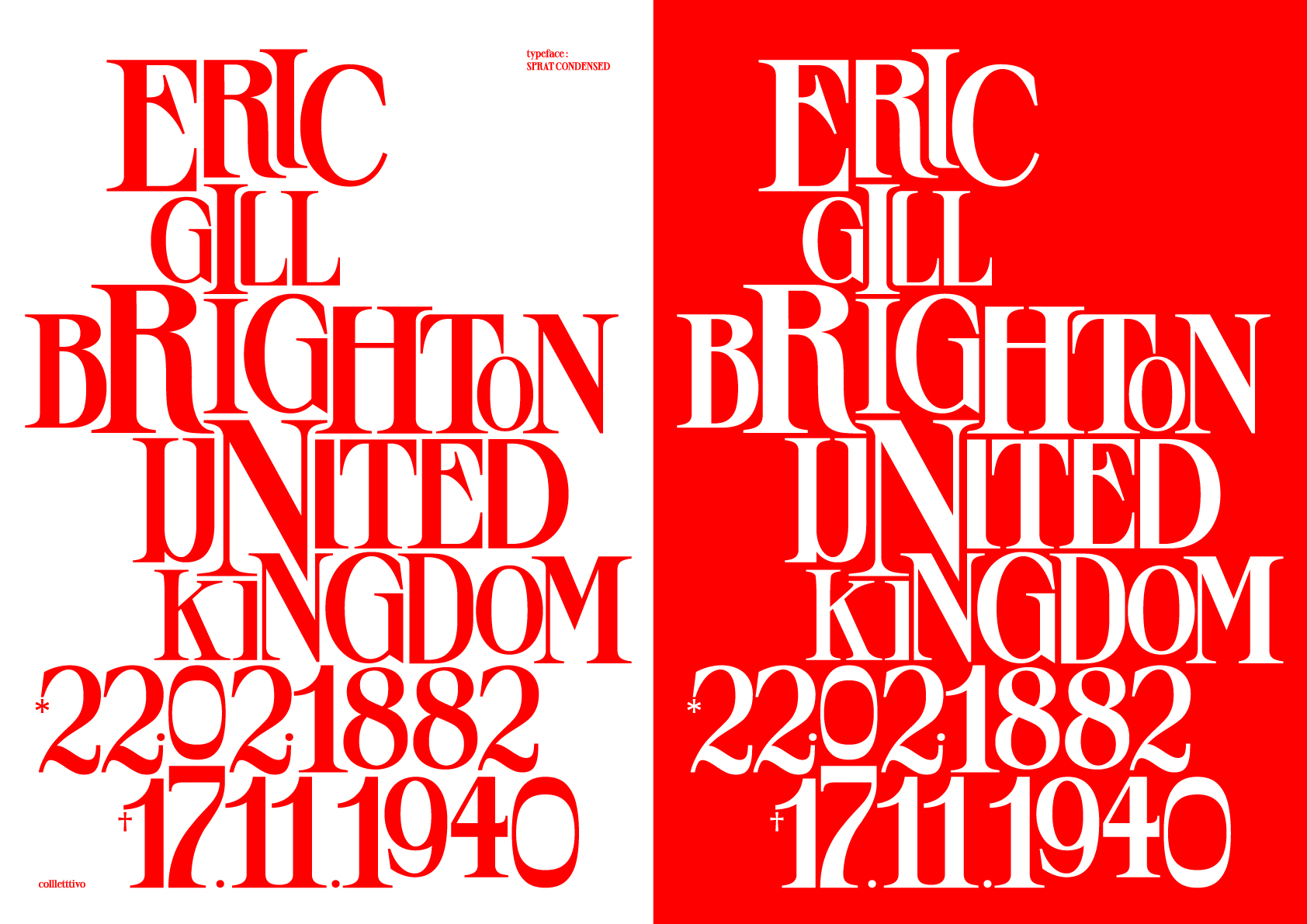
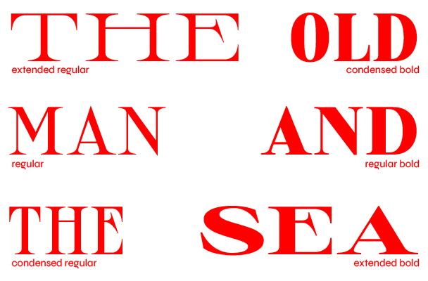
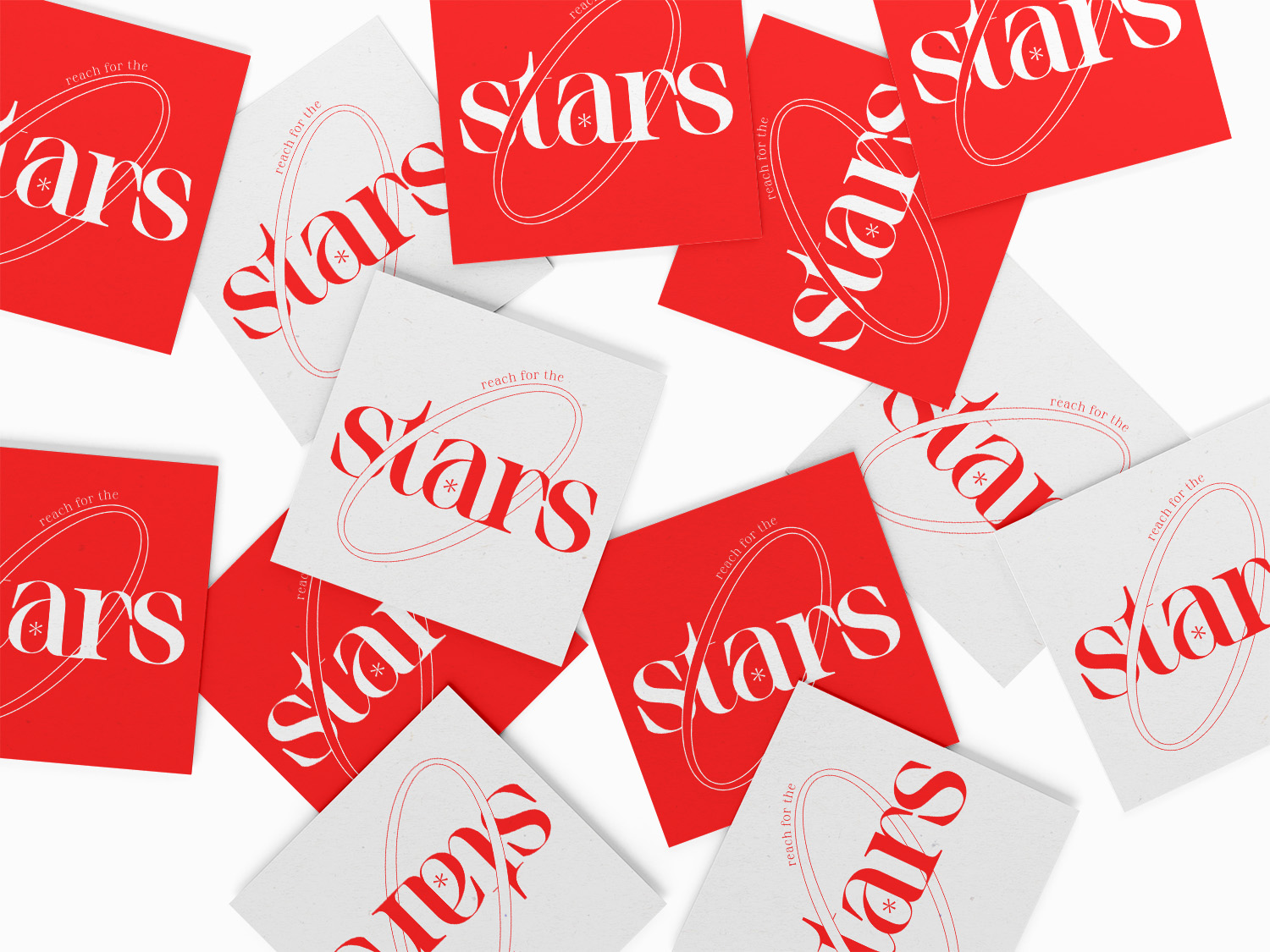
Sprat is a sharp serif variable font, developed on two axes: width and weight. Inspired by an old lettering from Eric Gill, it features long sharps serifs, high contrast and round curves. Its appearance changes a lot between styles, the thin ones have more of a hard and aggressive look, the blacks are smoother but keep their attitude. Its use is mainly suitable for titling, posters and logos but depending on the weight Sprat could also work in a mid-sized body text.
 Ethan is a french graphic & type designer based in Paris. He draws letters, typefaces, & logos and for clients, brands, foundries and himself. He can also develop, produce and refine typefaces and logotypes as well.